When I started programming I was mostly writing backend code. Most of the courses I took in college required us to write programs in C or
Java. During my summer internships I wrote desktop applications in C# with a MySQL database. While working on a desktop app in the
summer of 2015, I realized that what I enjoyed most about building it was creating the user interface. I remembered how much I enjoyed
the intro to HTML class I took in high school where I built websites using the <table> element. This is when I decided I wanted to push my
career towards frontend web development.
Version 1.0
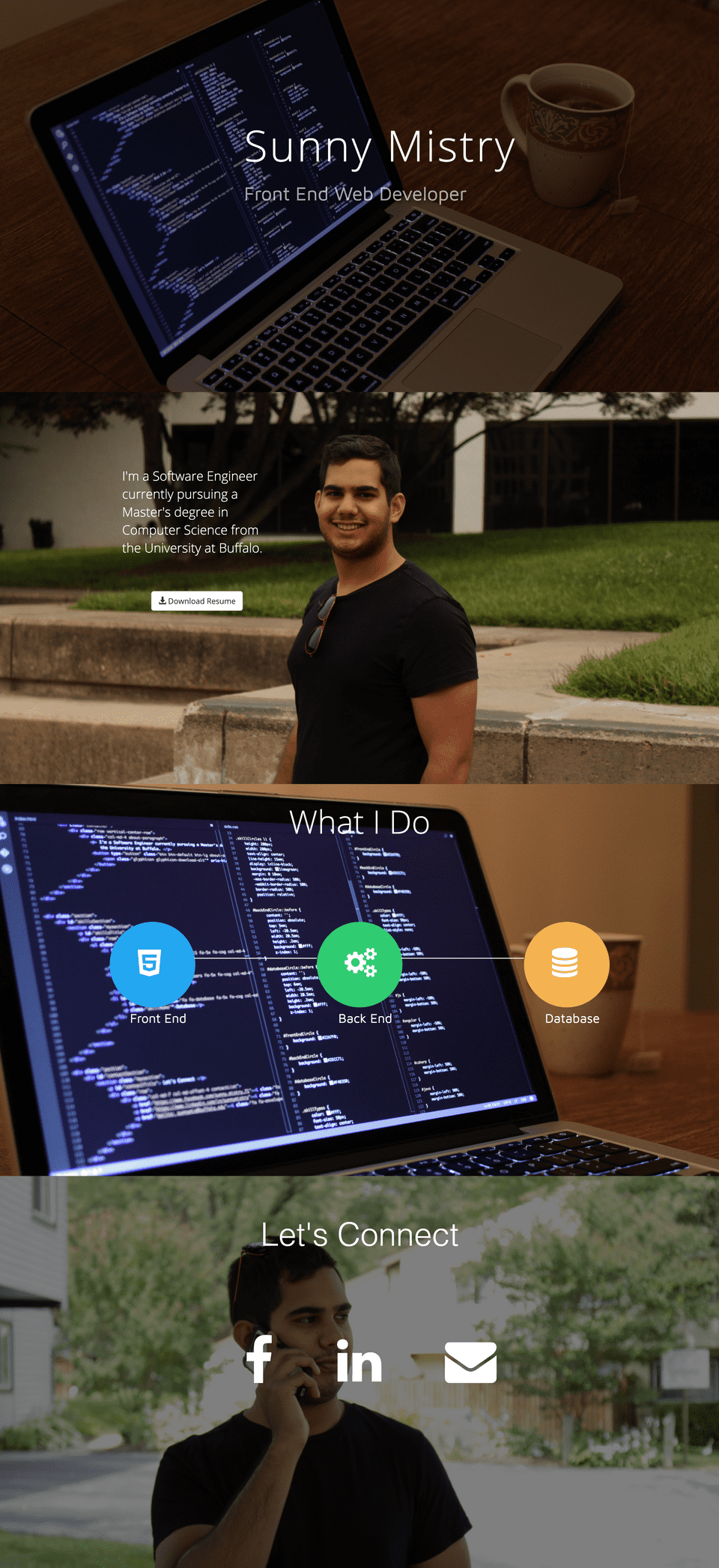
That summer, I built my first website. It comprised of four full width, full height screens with wallpaper background. There was a title screen with my name and description, an about me screen with a link to my resume, a screen that showed I was a full stack developer, and lastly, a contact me screen. The site included a feature that hijacked the native browser scroll and scrolled down just enough to show the next screen. The subtitle under my name rotated through 3-4 phrases and animated in a way that looked as if it was being typed across the page. Yes, the wallpaper size photos of me were a bit too much. The stock photos of the laptop and mug were taken by me.
Version 2.0
A year later I was finishing up school, interning as a fullstack web developer, and looking for full time jobs as a web dev. The current state of my site did not accurately reflect my HTML/CSS skills, so I built version 2.0 of my site.
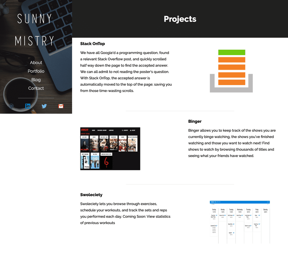
This time I didn’t hijack the browser’s scroll. I didn’t include any wallpaper size photos, but instead I put a massive cropped photo of myself. The site featured a left rail containing links to different pages on the site and everything to the right of the rail was scrollable content. Instead of linking to a resume hosted in a bucket somewhere, I decided to create an online resume by building a timeline. This made it much easier for someone to see what I’ve done, what technologies I’m familiar with, and, most importantly, my ability to write decent CSS.
The site was built using Jekyll. I wanted to eventually start writing posts about my work but never wrote a single one. Jekyll was very popular at the time and it was fun to learn how templating and static site generation worked.
Version 3.0
Version 3.0 came out in 2017. I was happy with the content that was on the site, but because there wasn’t a ton of content I didn’t think each section required its own page. Instead of multiple small pages I updated it to be one long page with several sections. The design reverted back to the original structure but this time it looked much better. The site still included a big, cropped picture of myself, a timeline, and projects.
This nav moved from the left rail to being sticky on the top. It transitioned from a transparent to black background on scroll. During this time, JavaScript was going through its golden age. There were tons of build tools, frameworks, and services available. I was fortunate enough to work at a startup incubator during this time, which provided me the opportunity to work with a huge variety of technologies. I chose to list them all in a grid. For my projects, I removed the screenshots of the UI and replaced them with logos that I designed myself.
Version 3.5.
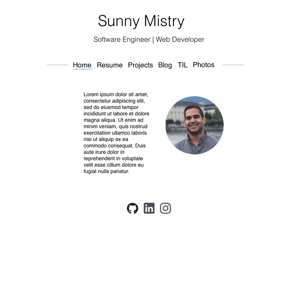
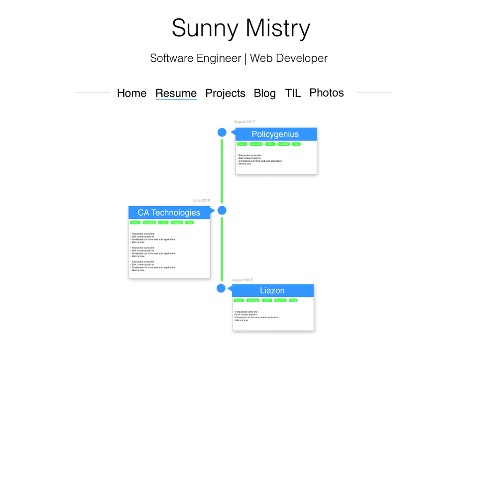
Version 3.5 never made it into production. It lives in Sketch and will never see the light of day. I spent a long time trying to figure out what I wanted from my website and how I wanted it to look. I’m not a UI/UX designer so the site didn’t look great. I had a vision for it but couldn’t execute on it because I kept redesigning. I spent so many months bouncing back and forth between coding and designing that I ended up going nowhere. Eventually I just stopped working on it.
Version 4.0
You are looking at version 4.0. It was built in December 2019. So how did I overcome being stuck in a rut and not being happy with how my website looked? It was during the holidays and I had time to reflect on why I wanted a personal website to begin with. My ultimate goal is to get a deeper understanding of web development by writing about what I’ve learned and teaching others through my content. I stopped caring so much about the aesthetic of the site and focused on just getting something out that enabled me to write and publish quickly. Improving the design and giving it more of my personality can happen gradually over time.
This site is built using a template GatsbyJS site. I made some modifications and customizations to the CSS and Gatsby build process. Having most of the content publishing infrastructure already in place enabled me to quickly release posts. I’m happy with this site as it does look similar to the original mockups I made in v3.5. I kept the timeline but introduced two new sections. The one I’m most excited about is the Today I Learned page. Here I can document and share any interesting things I’ve learned. The new Books page is where I can document what I’ve read each year. One of my goals this year is to read more so hopefully this will keep me accountable.
Also, as you may have noticed, I finally learned my lesson and removed the huge cropped photo of myself. Now it’s just a headshot.


